branding
Work
- This marketing agency from Mexico City, needed a new logo so they contacted us looking for some simple and easy to remember branding. They took their name from the blood factor which, during the design process, made us integrate elements of laboratory instrumentation that are used when handling blood samples. The branding for this project contains a rectangle resembles a test tube and the typography is placed at the bottom as if it were blood contained in it thus giving a great foundation to the logo. The result is an exciting concept based in the knowledge we have of the market.
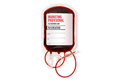
Factor RH+ Marketing
- Branding for a TV show from Puerto Vallarta, Mexico that required a youthful, urban and international spirit. The solution was to create a stain that simulates a stencil to give it a mark of power, activity and controlled rebellion of today’s youth market. Being a cutting edge television program, Overground needed a solid branding where the figures and forms could be easily animated. The typography used in this visual identity was chosen for its linear traits that give it clarity and strength accompanied with excellent legibility for broadcast and print, while the stencil stain that simulates a dot/ grammar period made with spray paint, and the geometric shapes on the background give it a sense of power and activity.
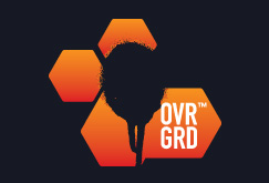
Overground TV
- Netcode is a virtual guide, based in Guadalajara, Mexico of everything related to art, music, fashion, gastronomy and lifestyle of latin america that needed a new look so we designed a branding system based on the way that information is distributed, which is the main goal of this company. The web design included a colour-coding system, every section obeys to a series of visual elements making the navigation more organised. During the creative process we emphasized on asia's web design and development style being that the company is pretty popular in this region.
Netcode
- Cervantes Gutiérrez Abogados is one of the most renowned law firms in Puerto Vallarta, Mexico so when the company was taken over by the founder's sons, they needed branding and web design work done, so that their image reflected professionalism and the vast legal knowledge that characterized the firm. Our job consisted in communicating to their potential clients all the experience the firm has in the legal field, so we developed a sober and balanced logo that represents equity and integrity, moral values that the firm wants to reflect. We also decided to print the accent over the letter É on a metallic ink, which makes it stand out against white backgrounds making the logo elegant-looking while at the same time reminding us of a scale: ancient symbol associated with law practice.
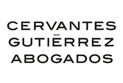
Cervantes Gutierrez
- MLSVallarta is a Multiple Listing Service that has operated in the Puerto Vallarta & Banderas Bay region for almost 30 years, time during which it has become the most popular and reliable source of real estate information, as well as a very useful tool of searching houses, departments and other properties for sale in the area. To bring in new energy, the company is renewing itself from the top bottom, so they commissioned Play Us Design their branding renewal. By listening to MLSVallarta and their customers’ needs, we learned that the project should emphasize the friendliness and ease of use of the system, which led to the creation of iLi, a character that visually assist users as they navigate the site and will incarnate the reliability and simplicity of the system. iLi also appears on the company’s promotional materials, making it easier for potential customers to relate to the
MLSVallarta
- BMW Paricutin, working together with BMW Mexico was about to host the 2013 edition of their Michoacan Rally and they needed the branding and web design work for the event so they came to us. Being an event focused on an older audience, we designed an identity based on the vintage packaging found on motorcycle parts and oils, while at the same time keeping the modern and vanguard look that make the brand appealing to a younger audience. The whole branding was applied to a vast array of promotion elements such as flags, hats, ID's, etc. A fundamental part of this project was the web design focused on the participants where they could find helpful information regarding the trip to Michoacán as well as a registry and payment system for the contestants that included a personal profile where you could find their info regarding their performance throughout the
BMW Rally
- Founded in 1986, this pioneering enterprise, the spectacle business leaders in Puerto Vallarta, Mexico decided to refresh their image in 2012 with the purpose of giving the company a look that reflected the experience acquired in all this years in the business. This new branding shows modernity using elements of show lights, this is where the combination of green and black as light and darkness comes from. The logo uses the negative spaces of the triangles to form the abstraction of a W. The company’s new image was complemented with a web design where they offered their services as an effort to make the company’s history and contact information available to all.
Winners
- dB+ is a multi-channel audio project developed in Guadalajara, Mexico by producer Juan Almeida that consists in using 8 audio channels that create a 360° environment for the listener. Being this auditory process too complex for most people, we elaborated a branding system that had simple and modern forms, and because it’s a digital experiment we tried to give it a technological appearance by using lines but keeping an organic feel through images and colors on a secondary level.
dB+ Audio Experiment
- When BMW Mexico, the prestigious car manufacturer, was celebrating their 16th annual international convention in Uruapan, they needed an identity for the event that would be appealing to the mexican market but at the same time respected the simplicity and elegance of the brand and we were put in charge of developing it. During the branding design process, we concluded that the essence of Michoacán State lives in its people's traditions so we combined elements like San Juan Parangaricutiro Church with symbols related to motors sports, all of this contained in a shield which is related to road signage. We also were commissioned with the web design for the event, we developed a website where participants could create a profile and upload their info and progress as well as pay for fees directly online.
BMW International Convention
- Branding, graphic design and motions graphics for artist Ángel Delgado, organizer of Close up an independent film festival from Puerto Vallarta, Mexico. He came to us looking for a mere poster, but seeing the potential of the upcoming festival, we proposed a new branding concept to give the festival a modern look, we used the circle as a representation of the human eye as well as a camera lens, and we used multiple shades of gray to give it a zooming effect.

Close Up Vallarta
- Protege is a firm dedicated to providing peace of mind to their customers through protection plans and asset development. Founded as a small family business it thrived and formalized quickly, that’s when the need to create a brand identity appeared. When they approached us, the company’s director knew what his business should reflect: security and trustworthiness. Developing the branding, we used a padlock as a graphic element that reflects security and a calming blue tone, associated with the intellectual part of the individual. These features were implemented keeping in mind the qualities of this company’s target market: conservative, cautious individuals who make conscious decisions. An website was also designed to display the wide range of services and plans offered, it works together with the branding to consolidate the company’s professionalism.
Protege
- Branding and web design for Puerto Vallarta, Mexico photographer Eduardo Solórzano. The logo takes its inspiration from a camera diaphragm, containing itself the monogram ES. Our client was looking to optimise stationery resources so we devised and developed a stamp that could be used on the diverse media elements that our client could need such as paper, business cards, envelopes and cd's. Thus having a tool that can turn any surface into a branding element.
Eduardo Solorzano
- Altura Residencial is a newly created company from Guadalajara, Mexico that offers comprehensive architectural services such as design and construction. They specialise in the development of skyscrapers which design takes into account their surroundings, so it was very important for them that their branding made them look like the modern and responsible company they are. The colour choice comes from the cyanotype process that used to be popular when copying blueprints, this along with the abstraction of the letters A and R which form a city's horizon, reflecting the company's dynamism.
Altura Residencial
- MediaSpace, a marketing company from Puerto Vallarta, Mexico needed to refresh their image to faithfully represent the direction that they were taking, so we took their branding to the next level and above their competition. The colour scheme reflects a technology based company on pair with global trends, emphasising the use of a symbol that represents communication in its simplest form, along with a typography that follows this simplicity.

MediaSpace
Play us design
Intelligent branding
Elegant thinking
MX +52 (322) 2228410
US +1 (714) 673-3783
Like our game? Play with us
hola[at]playus.com.mx


